Overall Impression
The A&O Shearman website features a modern, minimalist design that instantly conveys sophistication and professionalism. The site is designed with user experience in mind, ensuring that information is easily accessible while projecting an image of competence and elegance.
The generous use of white space and well-defined sections create a modern aura, making it ideal for a top-tier law firm aiming to lead in its industry. The website's bold typography, consistent color palette, and strong brand identity lend it a polished and trustworthy appearance.
Composition
Layout
The design uses a grid layout, offering structure and consistency throughout the page. This approach ensures that key elements are aligned and organized in a visually appealing manner. The design creates clear pathways for engagement by prioritizing essential information. This focus helps prevent information overload, allowing users to quickly access the most relevant content.
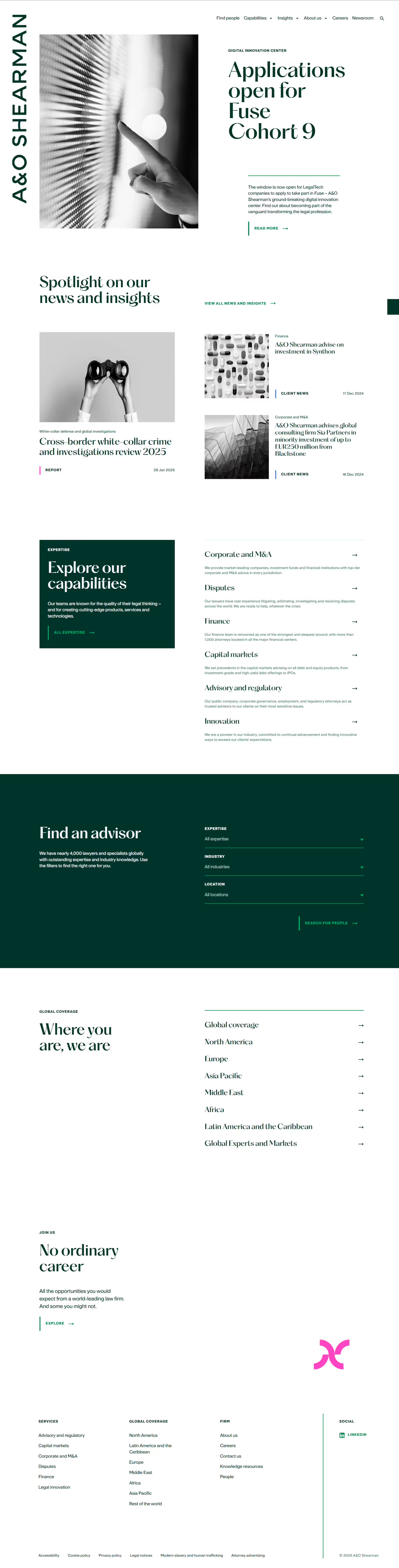
The logo is placed vertically along the left edge, almost like a "spine." This unusual placement sets the brand apart and ensures constant brand presence.
Major content sections - such as the hero banner, news spotlight, and the firm's capabilities - occupy generous vertical space. This provides a clear demarcation of focus areas and reduces content overburdening.
Navigation
The website's top navigation is streamlined, featuring a concise and intuitive menu. A secondary filter bar is positioned in the middle of the page, allowing users to quickly locate specific expertise without searching multiple pages. The minimalist main menu and clear calls to action (CTAs) throughout the site make navigation straightforward.
Visual Hierarchy
The design features a strong visual hierarchy that effectively guides the user's eye across the page. A large, high-quality hero image and prominent headlines immediately capture attention and convey the key message. The following sections are well-organized, with clear headings and concise descriptions, allowing users to scan and locate the necessary information quickly.
Use of Whitespace
Ample white space (and occasionally dark green) around each content block highlights the significance of each section. This negative space naturally guides the eye from one topic to the next, creating clarity and a sense of breathing room. The generous use of space promotes openness, prevents the page from appearing cluttered, enhances readability, and allows key elements to stand out, improving the user experience.
Use of Contrast
A rich forest green color contrasts beautifully with white or light gray backgrounds, highlighting headlines and key action areas. Subtle grayscale imagery and minimal accent colors enhance the visibility of the dark green text and call to action, effectively reinforcing both the brand and the message.
Branding
Color Palette
The dominant deep-green color signifies trust, stability, and a connection to tradition - essential qualities for a global law firm - while maintaining a contemporary feel. A bright magenta or pink accent color is used sparingly, adding just the right amount of vibrancy and modern flair to the design. The overall color palette is sophisticated and professional and is consistently applied throughout the site to reinforce brand identity.
Typography
The design incorporates a classic yet modern serif font for headlines, conveying an authoritative and established presence. In contrast, a clean sans-serif font is utilized for body text, enhancing readability. This combination balances timeless elegance with approachable clarity, making it ideal for legal content.
The typography features a clear hierarchy in sizes and weights to effectively guide the reader's eye. Dark green text on a white background offers strong contrast, making headings and body text stand out. The font sizes are well-proportioned, and generous line spacing ensures that paragraphs are legible.
Imagery
The imagery is either abstract or conceptual, such as a hero image of a hand interacting with a digital surface or muted grayscale photos. This choice implies innovation and forward-thinking without distracting from the core messages.
The polished aesthetic is further enhanced by using professional, high-resolution images carefully chosen to complement the content and reinforce the firm's brand message. The imagery is purposeful, showcasing global and innovative themes instead of relying on generic stock photos of office settings.
Content Presentation
Copy Effectiveness
Headlines indicate what users may need at a glance, establishing quick relevance. Subheadings and concise, descriptive paragraphs present key insights or offerings, keeping the reader's attention and encouraging further exploration.
Calls to Action (CTA)
CTAs such as "Read more," "Explore," or "Find an advisor" are clearly labeled and visually distinct from the background. Placing these CTAs near related sections (e.g., after news updates or capability outlines) encourages immediate action.
Trust & Credibility
Presenting thought leadership content establishes the firm as an authority. Client news updates and mentions of global coverage further enhance credibility and domain expertise. A filter-based advisor search emphasizes the firm's worldwide reach and specialization, easing the process for prospective clients.
Why It's Effective
The design merges modern aesthetics with a clear hierarchy and strong brand signals. It illustrates how a top-tier law firm can use minimalism and strategic content placement to convey innovation and tradition.
This design is successful because it prioritizes user experience, emphasizes essential information, and reinforces the firm's brand identity. It effectively entices and engages potential clients with a clean aesthetic, intuitive navigation, and mobile responsiveness.
Clear Brand Presence
The firm's name is placed in a unique orientation (vertically at left), and a consistent color palette ensures brand recognition at every step.
Visually Appealing Yet Professional
The choice of a refined serif for headers paired with open, modern layouts appeals to both corporate sensibilities and clients who expect a polished digital experience.
Easy-To-Follow Hierarchy
By presenting large, bold headlines and ample whitespace, the site allows users to scan and navigate, finding the content they need quickly.
Effective Use Of CTAs
Concise calls to action, well-placed near high-priority content, guide visitors toward taking steps that matter - learning more, exploring the firm's services, or contacting an advisor.
Establishing Trust & Expertise
Prominent client stories, advanced research insights, and global coverage links validate the firm's expertise, creating confidence in prospective clients that they're dealing with a competent, reputable practice.