Overall Impression
The Ashurst website presents a refined, modern, and professional digital presence. A well-structured design, strong branding, and engaging content effectively communicate the firm's expertise while remaining visually appealing. The site balances authority and approachability, making it suitable for high-level clients seeking legal services.
The layout and imagery create a welcoming yet sophisticated aura, reinforcing trust. Large typography, a harmonious color scheme, and a clear information hierarchy ensure a smooth experience. The thoughtful use of whitespace and contrast enhances clarity, making navigation seamless and engaging.
Composition
Layout
The layout follows a well-structured grid, offering a balanced mix of imagery and text. Large hero sections create an impactful introduction while supporting content is arranged in distinct modules, allowing easy scanning. Each content block is clearly separated, ensuring smooth transitions between sections.
A strategic blend of full-width imagery and text-based highlights naturally guides users through the site. Key topics like leadership insights, reports, and global locations are distinctly arranged, making it easy for visitors to explore relevant content without distraction.
Navigation
The site employs a streamlined top navigation bar that keeps options concise while ensuring access to essential pages. Dropdown menus provide deeper navigation without overwhelming users. The search function is prominently placed for quick access, while intuitive section links within content encourage further exploration.
Visual Hierarchy
A clear visual hierarchy directs attention to key elements. Bold headlines contrast with supporting text; high-quality imagery draws users into specific topics. Primary CTAs encourage user interaction, while well-placed subheadings improve readability and content flow.
Use of Whitespace
The design utilizes generous whitespace to create a clean and modern aesthetic. This prevents the page from feeling cluttered and ensures each content section stands out. The balance of text and space enhances readability while reinforcing a sense of professionalism and sophistication.
Use of Contrast
Contrast is effectively employed through color, typography, and image selection. Combining dark and light backgrounds creates visual variety, while accent colors highlight essential information. The bold use of red for key text elements provides emphasis without overwhelming the design.
Branding
Color Palette
The color palette is professional and sophisticated, primarily using neutral tones with striking red accents. This balance conveys trust, authority, and a modern edge, reinforcing Ashurst's brand identity. The use of red in text and CTAs draws attention without feeling excessive.
Typography
Typography is a strong element of the design. It combines a modern serif for headlines with a clean sans-serif for body text, ensuring a balance of authority and readability. Font sizes are well-scaled, creating a natural reading flow while emphasizing key sections.
Imagery
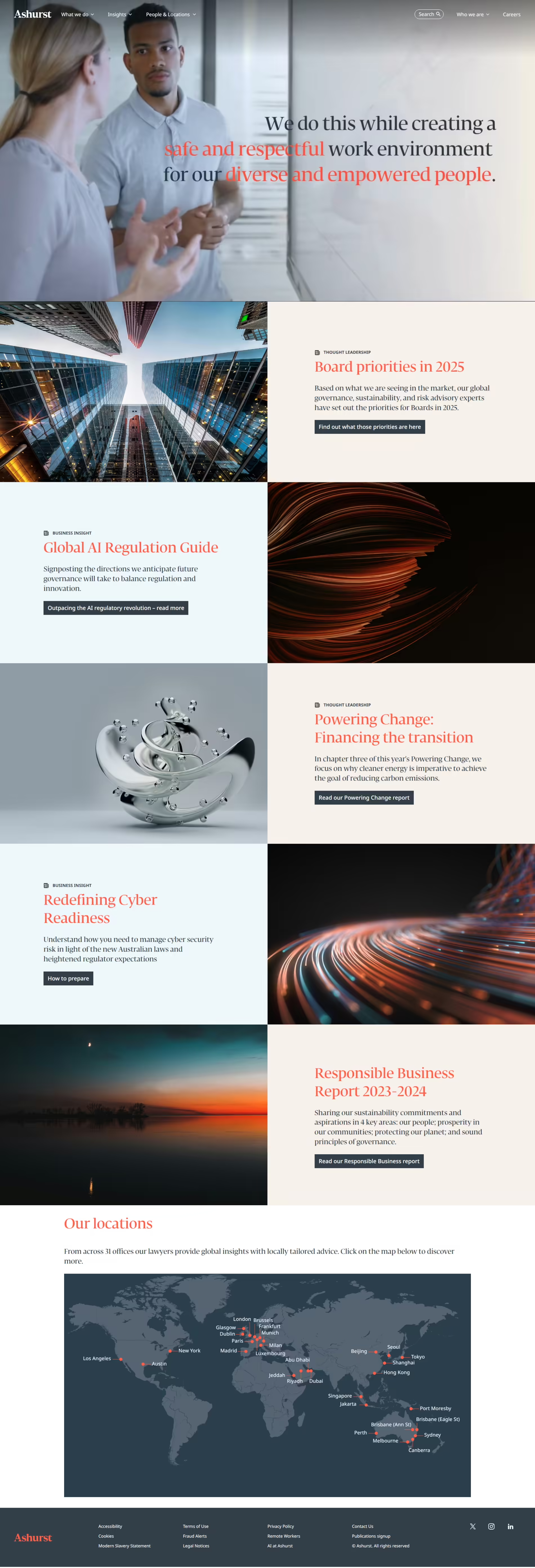
The imagery is high-quality and purposefully selected, featuring business environments, global landscapes and abstract concepts. This combination reinforces the firm's modernity and expertise. The use of muted tones and conceptual visuals convey credibility without feeling overly corporate.
Content Presentation
Copy Effectiveness
The copy is concise and impactful, delivering key messages efficiently. Headlines are engaging while supporting text remains informative without being overwhelming. Thought leadership and industry insights are presented clearly, showcasing expertise without excessive jargon.
Calls to Action (CTA)
CTAs are well-placed and visually distinct, guiding users toward further engagement. Buttons such as "Find out more" and "Read our report" provide clear pathways to additional content, encouraging visitors to take action. The contrast between CTA elements and the background ensures they stand out.
Trust & Credibility
Trust is established through authoritative content, including reports, insights, and regulatory guidance. A detailed locations section emphasizes the firm's global presence, reinforcing credibility. Professional visuals and strategic messaging further position Ashurst as a leading legal firm.
Why It's Effective
The Ashurst website delivers a professional, polished, and engaging user experience. Its structured design, strategic branding, and compelling content establish it as a leader in the legal industry. Modern aesthetics and intuitive navigation ensure visitors can quickly access the information they need.
This site's effectiveness lies in its seamless branding, usability, and thought leadership integration. Prioritizing clarity, visual appeal and strategic content placement successfully communicates Ashurst's expertise while creating an inviting yet authoritative digital presence.
Strong Brand Identity
The site reinforces Ashurst's brand through a consistent color scheme, typography, and visual style, ensuring immediate recognition and credibility.
Engaging Visual Composition
The balance of high-quality imagery, whitespace, and structured layouts creates a visually appealing experience that maintains a professional tone.
User-Friendly Navigation
A well-organized menu, precise sectioning, and intuitive CTAs ensure users can easily access relevant information without frustration.
Thought Leadership Positioning
Including industry insights, regulatory updates, and reports showcases the firm's expertise, strengthening its position as a trusted authority.
Clear & Impactful Messaging
Concise copy, bold headlines, and strategic content placement make key messages easy to absorb while maintaining a refined and professional tone.