Overall Impression
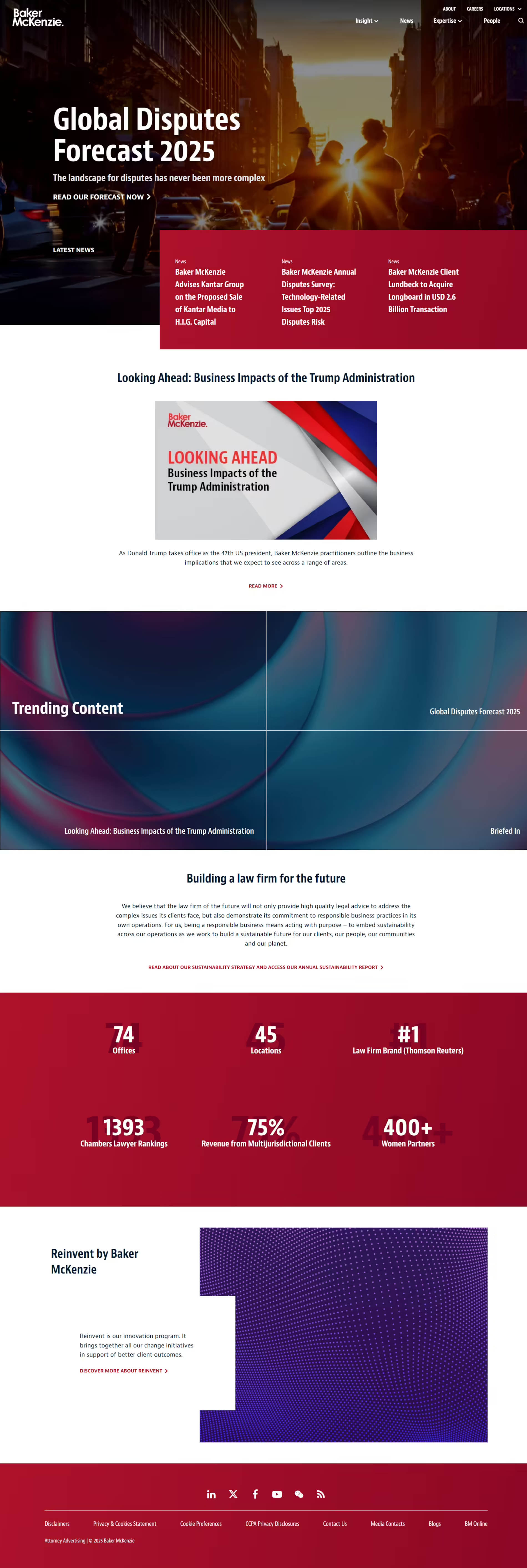
The Baker McKenzie website delivers a bold, modern, and authoritative presence. Strong typography, high-contrast colors, and dynamic imagery effectively convey the firm's global influence and expertise. The design leans toward a forward-thinking aesthetic, making it both engaging and impactful.
The layout effectively balances content-heavy sections with visually striking elements, ensuring an immersive, structured browsing experience. Strong calls to action, high-impact headlines, and a streamlined navigation make it easy for users to engage with key topics and explore the firm's thought leadership.
Composition
Layout
The site follows a modular structure, strategically organizing information into distinct sections. Each section is visually separated, making navigation intuitive and preventing content overload. The hero banner, news highlights, and firm statistics are prominently placed to maximize engagement.
Combining full-width images, text blocks, and split-screen elements creates a dynamic browsing experience. Asymmetry in certain sections adds a sense of modernity and movement, keeping the content visually engaging while maintaining clarity.
Navigation
The primary navigation is concise, featuring dropdown menus that allow deep exploration without cluttering the top menu. The search function is clearly visible, offering quick access to information. Secondary navigation links within content sections further enhance usability.
Visual Hierarchy
The website employs a strong visual hierarchy, ensuring that key information stands out. Large, bold headlines command attention while supporting text is kept succinct. Strategically placed imagery and clear section breaks create an intuitive reading flow.
Use of Whitespace
The design uses white space effectively to avoid visual clutter and create emphasis. Generous spacing around text and imagery makes elements stand out, improving readability and guiding the user's focus through the content.
Use of Contrast
A high-contrast palette of deep red, white, and dark overlays enhances readability and visual impact. White text on dark backgrounds and bold red highlights ensure that calls to action and key messages remain prominent. The contrast between typography sizes further aids in information clarity.
Branding
Color Palette
The deep red brand color dominates the design, evoking confidence, strength, and tradition. It is complemented by dark overlays and white text, ensuring a polished, high-impact aesthetic. The consistent application of red across headlines and CTA elements reinforces brand identity.
Typography
The site utilizes bold, modern typography that conveys authority and professionalism. Large uppercase headlines contrast with clean, readable body text. The font weights and size variations create a strong typographic hierarchy, making content easy to digest.
Imagery
High-quality imagery plays a significant role in storytelling. The hero section features dramatic cityscapes, reinforcing a global and future-focused perspective. Abstract visuals and professional graphics in supporting sections add depth and innovation to the design.
Content Presentation
Copy Effectiveness
The copy is concise and impactful, with direct messaging quickly communicating key insights. Headlines are bold and engaging while supporting text remains to the point. Strategic wording choice reinforces the firm's leadership and expertise.
Calls to Action (CTA)
CTAs are well-placed, ensuring engagement opportunities throughout the site. The "Read More" and "Discover" buttons stand out due to their contrasting color and clear placement, seamlessly guiding users toward additional content.
Trust & Credibility
The site reinforces trust through prominently displayed firm statistics, accolades, and industry recognitions. The "Building a Law Firm for the Future" section highlights sustainability commitments, strengthening the firm's reputation as a responsible and forward-thinking entity.
Why It's Effective
Baker McKenzie's website is a powerful example of how a law firm can combine bold design with structured content to create a compelling digital experience. Its strong branding, dynamic visuals, and user-friendly navigation create an engaging and professional presence.
By blending striking aesthetics with intuitive usability, the site offers direct access to valuable insights. The high-impact design reinforces the firm's authority and expertise, making it an exemplary model for legal practice sites.
Bold & Engaging Design
The high-contrast colors, strong typography, and dynamic imagery create an impactful visual presence that immediately commands attention.
Clear & Intuitive Navigation
A structured menu, dropdowns, and contextual links make it easy for users to explore content without feeling overwhelmed.
Strong Brand Reinforcement
The deep red color, bold typography, and professional imagery consistently reflect Baker McKenzie's global identity and authoritative positioning.
Strategic Content Placement
Essential insights, firm highlights, and leadership messaging are positioned effectively to ensure visitors engage with key topics.
Emphasis On Thought Leadership
The inclusion of reports, insights, and data-driven content positions Baker McKenzie as an industry leader and a trusted source of legal expertise.