Overall Impression
The BUREN website delivers a bold and professional digital presence. Strong visual elements, high-contrast colors, and strategic content placement effectively communicate the firm's expertise in legal, tax, and notary services. The design conveys confidence and international reach, appealing to corporate clients and entrepreneurs.
The structured layout, engaging imagery, and well-organized content create an intuitive and seamless browsing experience. The mix of editorial storytelling and informative sections ensures visitors quickly understand BUREN's areas of expertise while reinforcing trust through success stories and industry insights.
Composition
Layout
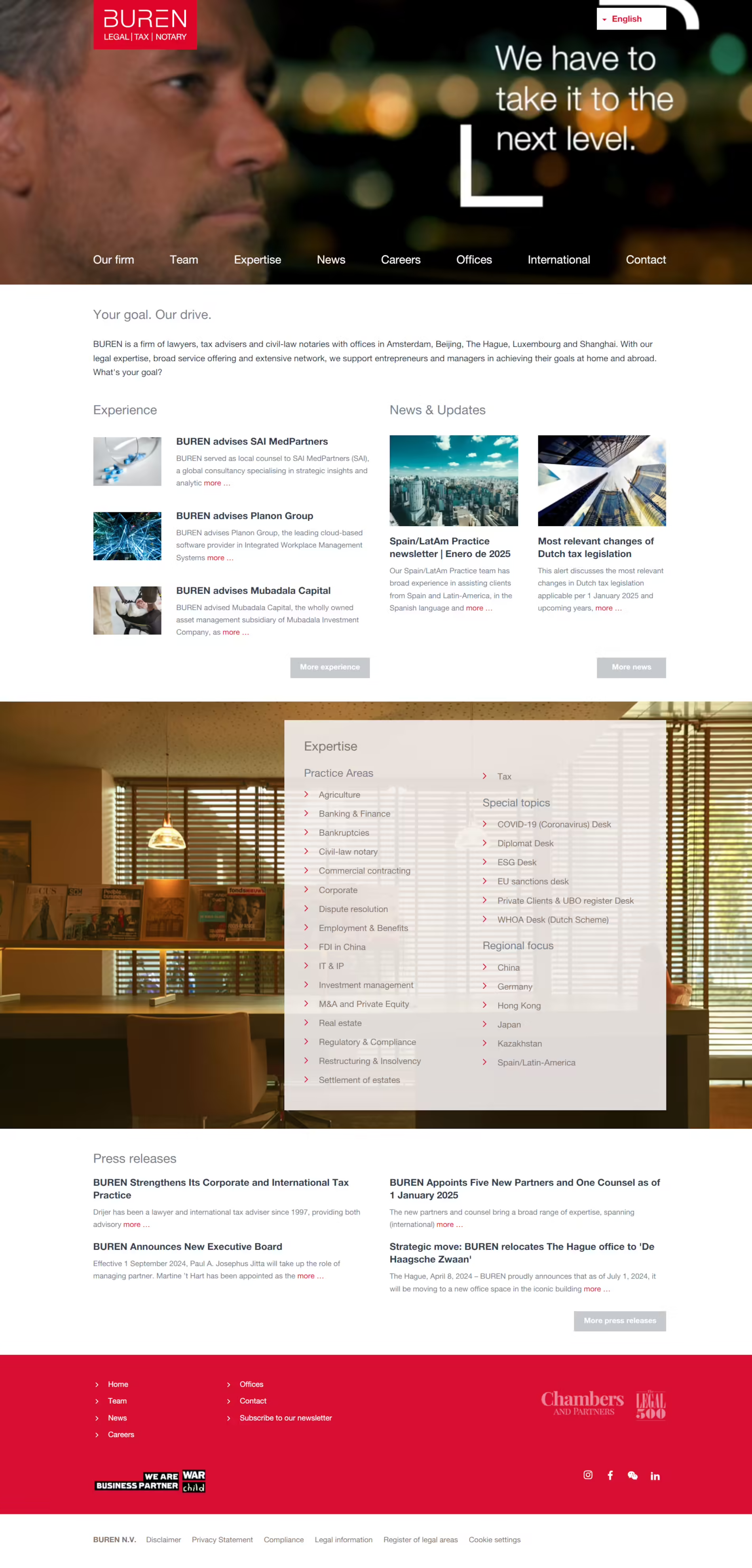
The website follows a structured grid layout, dividing content into clear sections. The hero banner, expertise categories, and news highlights are given ample space, ensuring each component stands out. Full-width elements and well-sized imagery contribute to a modern and professional aesthetic.
A combination of content blocks, icons, and interactive menus keeps users engaged while ensuring the page does not feel overwhelming. The navigation intuitively guides visitors through the firm's expertise areas.
Navigation
The top navigation bar is simple yet effective, featuring key sections such as expertise, news, careers, and offices. A well-structured footer with additional navigation options lets users quickly find important links. Dropdowns and in-content navigation further enhance accessibility.
Visual Hierarchy
The website utilizes bold typography and high-contrast elements to establish a clear visual hierarchy. Large, impactful headlines capture attention while supporting text remains easy to read. The structured arrangement of content ensures that important messages are conveyed effectively.
Use of Whitespace
Whitespace is strategically used to provide clarity and structure, preventing content from feeling cramped. This enhances readability and allows key sections, such as expertise and news, to stand out more prominently. The balance of negative space creates an open and sophisticated visual experience.
Use of Contrast
The website uses strong contrast through its red, black, and white color palette. Red highlights key information, while white text against dark backgrounds enhances readability. This contrast-driven approach ensures that important details, such as CTAs and headlines, stand out boldly.
Branding
Color Palette
BUREN's dominant red color conveys strength, confidence, and authority. It is effectively balanced with black-and-white elements to maintain a modern and appealing look. The sparing use of red for CTAs and key highlights ensures an impactful yet refined brand presence.
Typography
The typography is clean and bold, emphasizing professionalism and clarity. Large, uppercase headings create a strong impression, while the body text remains legible and well-spaced. Combining serif and sans-serif fonts contributes to a modern yet traditional aesthetic.
Imagery
High-quality imagery, including business professionals and city scenery, reinforces the firm's global presence. The hero banner with video reels adds a dynamic touch, while abstract visuals evoke a sense of ambition and progress.
Content Presentation
Copy Effectiveness
The copy is concise, authoritative, and informative. Key messages are clearly delivered, ensuring users quickly understand BUREN's expertise. Headlines and supporting text are well-balanced, making the content easy to scan and digest.
Calls to Action (CTA)
CTAs are strategically placed throughout the site, guiding users toward relevant actions such as learning more about expertise areas, reading news updates, or contacting the firm. Using red buttons and links ensures that CTAs are visually distinct and easy to locate.
Trust & Credibility
The website establishes trust through thought leadership, press releases, and case studies. Highlighting recent advisories, industry insights, and firm-wide updates positions BUREN as an authoritative source for legal and tax advisory services. The inclusion of office locations further reinforces global reach.
Why It's Effective
BUREN's website combines bold branding, strategic content placement, and user-friendly navigation to create a compelling digital presence. The professional design, reinforced by strong visuals and engaging typography, ensures an impactful and authoritative experience.
The site successfully communicates BUREN's global expertise with its modern aesthetic, clear messaging, and seamless usability. The combination of thought leadership, structured information, and high-quality visuals makes it an exemplary model for law firm websites.
Bold & Confident Branding
The strong red branding and high-contrast design create an immediate and lasting impression, reinforcing BUREN's authority in the legal space.
Clear & Engaging Navigation
A well-structured menu, dropdowns, and contextual links make it easy for users to explore content without friction.
High-Impact Visual Hierarchy
Large typography, strong contrast, and strategic placement of key information ensure an intuitive and engaging user experience.
Strategic Content Positioning
News updates, press releases, and expertise areas are prominently displayed, ensuring users quickly find the most relevant content.
Effective Calls-to-Action
CTAs are prominently highlighted, encouraging users to engage with the firm's insights, contact professionals, or explore specific practice areas.